Articles Menu

The risks of climate change are not easy to communicate clearly. Since the atmosphere affects everything, everything will be affected by its warming — there’s no single risk, but a wide and varied array of risks, of different severities and scales, affecting different systems, unfolding on different timelines. It’s difficult to convey to a layperson, at least without droning on and on.
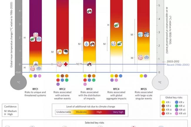
One of the better-known and more controversial attempts to address this problem is a graphic from the reports by the Intergovernmental Panel on Climate Change. The so-called “burning embers” graph attempts to render the various risks of climate change — “reasons for concern,” or RFCs — in an easy-to-grasp visual form.
In a new paper in the journal Nature Climate Change, a group of 17 scholars examines the RFC conceptual framework and reviews the latest science. (Because IPCC reports take so long to produce, the science they contain is always a few years behind.)
Long story short, they find that the graphic is generally accurate (though it has key limitations). They offer suggestions for how the RFC framework could be extended in the future to “better account for possible changes in social and ecological system vulnerability.”
I won’t get into the details — I just want to have a look at their new and improved burning-embers graph, which is up at the top of this post.
As you can see, there is a ton of information about the risks of climate change crammed in there, so it’s worth unpacking a bit. It offers a remarkably coherent overview of the various risks that lie ahead this century.
/cdn0.vox-cdn.com/uploads/chorus_asset/file/7770601/biodiversity.jpg) Biodiverse corals are in trouble. (Shutterstock)
Biodiverse corals are in trouble. (Shutterstock)
Here’s the graph again:
The thermometer on the right shows temperatures relative to preindustrial levels; the thermometer on the left shows them relative to 1986-2005. The distance between the two blue lines is warming that occurred through 2005. (As that note on the right indicates, warming is up a bit 2003-2012.)
Following the IPCC, risks are divided into five buckets or RFCs:
Scattered across these five buckets are eight “key risks,” coded by those little colored circles, and which RFC buckets they fall into. Here’s the key to those:
These are the more granular risks: rising sea level, flooding, infrastructure damage, food insecurity, etc.
For each RFC, there are four levels of risk: undetectable, moderate, high, and very high.
The little graphics along the bottom are selected key risks, which are plotted at various points on the graph to illustrate specific dangers. Next to them is a letter indicating the level of confidence scientists feel in predicting the risk — M for medium, H for high.
So, for instance, scientists believe:
RFCs 4 and 5 are the biggest, scariest dangers — the species-level impacts — but they’re also the ones in which scientists have the least confidence. Still, medium confidence that the Greenland and Antarctic ice sheets will come under high risk by 3 degrees ought to terrify us. That’s gambling with trillions of dollars.
There’s a lot to glean from this graph, but here’s the takeaway: We’ve already crossed over into moderate risk on the first three RFCS. Pushing temperatures up 2 degrees Celsius over preindustrial levels — the target at which the world claims to want to stop warming — puts us at high risk on the first three and moderate risk on the last two. That is the best-case scenario.
Three degrees over preindustrial levels, where we are very likely headed this century, puts us at high risk across the board, very high for those uniquely threatened systems. Five degrees, which is entirely possible, puts basically every human and ecological system at high to very high risk.
We are already in danger, there’s more danger to come, and the best we can hope for is to slow and stop the process before the dangers are catastrophic. That’s the shape of things.