November 26th 2020
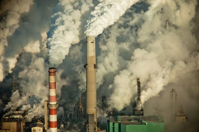
The world’s nations are racing to rein in the climate crisis while maintaining strong economies. Troublingly, Canada is far behind in this time-critical race to build a low-carbon economy. Our decades of foot-dragging have put both our future prosperity and our climate at risk.
To illustrate Canada’s precarious position, I’ve turned to two reports comparing how dependent many of the world’s major economies are on climate pollution. These reports measure “carbon intensity,” which is the ratio of wealth created (GDP) per tonne of climate pollution emitted (tCO2). You can think of it as a measure of how prepared we are to prosper in a low-carbon future.
How Canada stacks up
For the last decade, PricewaterhouseCoopers (PwC) has been tracking this critical economic metric with its Low Carbon Economy Index reports. I’ve used the data in its most recent report to create a series of charts showing how Canada stacks up against our global peers.
The first of my charts compares the world’s top 10 economies. The coin stacks indicate how much GDP each economy produces per tonne of CO2. These 10 economies produce 70 per cent of the world’s GDP. As you can see, Canada is second to last, and well below the global average. Our economy creates only $3,000 per tCO2 emitted. (Note: all monetary values are in U.S. dollars to allow comparison between countries.)
Only the coal-choked Chinese economy creates less GDP per tonne of climate pollution, at $2,600.
Our next closest competitor in the low-carbon economic race is our largest trading partner, the United States, which is running $1,000 ahead of us.
And take a look at the Europeans. The overall European Union economy is $3,400 ahead of us. They’ve essentially lapped us in this race, generating twice as much wealth as we are able to from each tonne of climate pollution. France is even further ahead, producing three times more GDP per tCO2 than us.
It gets worse. While being mired in second-to-last place in the low-carbon transition race is a decidedly risky position, the data shows our position is even more precarious than that.
Falling ever further behind
According to the PwC report, Canada's economy has also been one of the slowest at cleaning up over the last couple decades. We’ve been losing ground to all three of the world’s super-economies: the U.S., the EU and China.
My next chart tells that troubling tale.
Even the coal-choked Chinese economy is set to pass us by in our efforts to transition to a low-carbon economy, @bsaxifrage says. #ClimateChange #LowCarbonEconomy

I've added green to the coin stacks to show the changes since 2000.
For example, the green part of Canada’s stack shows we’re up 35 per cent since 2000. That increased our GDP per tCO2 by $800.
But China was cleaning up twice as fast. They increased their GDP per tCO2 by 67 per cent. They've nearly caught up to us. In fact, if these rates continue, China will pass us in the next decade — leaving Canada dead last.
What do you think? Are you ready to face the metastasizing climate crisis with an economy even more climate-polluting than China’s?
And China isn’t the only major economy that has been cleaning up much faster than we have. Back in 2000, we were neck and neck with the Americans. Since then, the U.S. economy has sprinted far ahead of us. They’ve improved their carbon intensity by 56 per cent, caught up to the world average and are on pace to pass both India and Japan in the coming decade. See ya later, Canada.
And the Europeans have likewise been racing ever further ahead of us.
The U.K. has been leading the way over there. It nearly doubled the amount of GDP it produces from each tonne of climate pollution. In fact, its increase of $3,700 is more per tonne than our economy can produce in total. How did our Commonwealth peer manage to sprint so far ahead of us? The short answer is that they reduced their climate pollution by 100 times more than we did (-250 MtCO2 versus -2 MtCO2). And they did that because they passed laws requiring it more than a decade ago.
The great Canadian divide
To try to gain more insight into why our Canadian economy lags so far behind our economic peers in this race, I decided to dig down one more level to see what our provincial economies have been doing.
Using data from Canada's National Inventory Report (NIR) and Statistics Canada, I calculated the carbon intensity for our six biggest provincial economies, which produce 95 per cent of Canada’s GDP and climate pollution. My next chart shows the results.
The first thing that jumps out is a huge divide in carbon intensities.
On one side are the Alberta and Saskatchewan economies that produce less than half the Canadian average. And they’ve been cleaning up much slower, as well. That has left them increasingly further behind.
On the other side of the divide are the other four major provincial economies — Manitoba, B.C., Ontario and Quebec. Each of these produces more GDP per tCO2 than the Canadian average. And they have all been cleaning up faster than the other side, widening the divide.
To see how this provincial divide measures up on the world stage, I’ve added each side to my original chart.

On the far left is a new red bar showing the combined economies of Alberta and Saskatchewan. They only manage to create around $1,400 in GDP per tCO2. That’s half of what the Chinese economy can produce per tonne of climate pollution. And these two provinces have been dragging their feet cleaning up, while China has been sprinting ever further ahead.
It's hard for me to imagine a riskier climate strategy than being twice as dirty as China’s economy and choosing to fall ever further behind.
Canada’s other four major provincial economies are combined in the new red bar between Japan and Germany. They’re in the middle of the pack and cleaning up at roughly the same pace as the U.S. and the EU.
But there’s reason to worry here, too. That’s because most of these gains since 2000 have come from a single policy in a single province: the coal phaseout in Ontario. And that’s now over.
So, Canada will need to find significant new emissions cuts elsewhere, and soon.
Unfortunately for our hopes of building low-carbon prosperity, we are still mired in denial, inaction and greenwash in Canada. For example, the province that had been leading the way, Ontario, recently abandoned many of its climate policies. Our federal government in Ottawa refuses to produce even a plan that, if ever implemented, would get us anywhere close to our Paris Agreement climate target for 2030. On the West Coast, B.C. is busy backsliding by expanding one of the most carbon-intensive sectors in its economy — fracked fossil gas. And its neighbours in Alberta and Saskatchewan are fighting in court to block even the few far-too-weak-to-meet-our-climate-targets policies that Canada does have.
The larger race
So far we’ve looked at Canada’s carbon intensity compared to the world’s other top 10 economies. I’ll wrap with a look at how we stack up against a much larger set of countries.
This next chart is from the Green Growth Indicators 2017 report by the Organization for Economic Co-operation and Development (OECD). It shows the carbon intensity for 46 nations, covering the years 1995 to 2014. I’ve highlighted the names of the global top 10 economies covered in the previous charts. And I’ve listed the improvement percentage for each over these years.
Where’s Canada?
Sadly, we are nearly in last place in this much larger group, too. And again, as this study highlights, we’ve been cleaning up far slower than most.
We’ve wasted two precious decades and are now even further behind.
One last sobering observation here is that the economies of Alberta and Saskatchewan would show up dead last on this chart — at around $1.2 per KgCO2 (a.k.a.: $1,200 per tCO2).
If you think that’s the inevitable result of being a northern oil-producing region, take a look at where Norway is. They are way up above France on the chart — producing $8,700 in GDP per tCO2. That is seven times more than Alberta or Saskatchewan. Climate failure is a choice.
Which of those economies would you rather have going forward into the teeth of the climate crisis?
The threat facing Canada is that time is running out. The accelerating climate crisis is rapidly shortening the time remaining to transition to low-carbon prosperity. Gone are the years when climate damage was a future threat.
Ready or not, we are all entering the age of climate consequences.
EXTENDED ENDNOTES
For those wanting a bit more detail on this critical metric, I’ve included some additional notes here.
1) Topsy turvy
In principle, carbon intensity is simple. It’s just the ratio of GDP to emissions.
In practice, however, it can get confusing because some sources report this ratio with GDP on top (GDP/CO2), while others report the inverse (CO2/GDP).
For example, the OECD report and my article use the first method. Carbon intensity is listed as dollars of GDP per unit of emissions. Canada’s carbon intensity is listed as US$3,000 per tCO2. In this version, larger numbers mean cleaner. Cleaner economies produce larger amounts of GDP per tonne of climate pollution.
In contrast, other sources like the PwC report and Canada's National Inventory Report (NIR) use the inverse ratio. They list carbon intensity as the amount of emissions per dollar of GDP. So, the same level of carbon intensity for Canada gets listed as 333 grams CO2 per dollar of GDP instead. In this version, smaller numbers mean cleaner. Cleaner economies emit smaller amounts of climate pollution per dollar of GDP.
And sometimes you may need to convert between the two versions to compare them. That’s what I needed to do with the PwC and OECD reports for this article. Fortunately, this is easy to do with a spreadsheet. Just invert either version to get the other. In math formula terms: versionA = 1 / versionB. For example, you can convert Canada’s $3,000/tCO2 by inverting it like this: 1 / $3,000/tCO2 == tCO2/$3,000 == 0.000333 tCO2/$1 (333 gCO2/$1).
2) Where Canada reports carbon intensity … and what is missing.
Canada spotlights the importance of carbon intensity in its official NIR. It is one of the four “key points” on page one of the executive summary. And it is featured in the report’s very first chart. Here it is:

While this highlights the importance of improving carbon intensity in Canada, it leaves out the critical information required to evaluate how well we are doing compared to what is needed. Missing are:
- Comparison with other nations — Are we keeping up, or falling behind, in the global low-carbon prosperity race? You can't tell from reading Canada's official NIR. That's why outside reports like those from PwC and OECD are critically important for Canadians to pay attention to. Without a sense of how we are doing relative to the world's biggest economies and our main trading partners, we are flying blind into a gathering economic climate storm.
- Comparison to our climate targets — Are we on track to building a future-proof economy that can still thrive if we choose (or are pressured) to cut emissions in line with our promises? If not, how much faster do we need to clean up? The NIR doesn't discuss what carbon intensity we need to hit our targets.
- Insight into provincial and sector trends — Which parts of our economy are cleaning up fast enough and which aren't? Are we putting our limited government funds and resources into areas that are delivering high GDP per tonne? Or are we subsidizing and expanding the lowest return and the slowest to clean up options? We can't get to low-carbon prosperity if we don't even have the basic data that shows the carbon intensity of the major parts of our economy, and what the trends are.
3) Carbon intensity for all provinces and territories … and the oil and gas sector
In the main article, I presented carbon-intensity data for our six main provincial economies. For those interested in the rest of Canada, here is an expanded chart that shows all provinces and territories.

Among the smaller provinces, New Brunswick (+79 per cent), P.E.I. (+67 per cent) and Nova Scotia (+52 per cent) all cleaned up faster than the Canadian average (+35 per cent).
Newfoundland and Labrador (+9 per cent) cleaned up slower.
And while all three northern territories are shown as getting dirtier over these years, it's not clear that has really happened. Their emissions are so small compared to the NIR data rounding in their tables that it is hard to say for sure what happened with these three.
Finally, I've included one sector example on this chart to highlight how measuring and tracking carbon intensity is so critical in the low-carbon economic race. See the smallest stack of all at the far right? That's Canada's most climate polluting sector — oil and gas extraction.
The data shows that the oil and gas sector emits 26 per cent of Canada's emissions to produce roughly six per cent of our GDP. That means it creates only a quarter as much GDP from each tonne of climate pollution as the Canadian average. (Here's the simple math: six per cent GDP/ 26 per cent GHG = 23 per cent of Canada's average GDP per tCO2.)
To make matters worse, the same data shows that the oil and gas sector has been cleaning up only half as fast as rest of our economy at just 15 per cent since 2000. That foot-dragging has left this industry ever further behind.
And yet, despite this industry making so little GDP from its emissions, and despite it cleaning up so slowly, Ottawa has still allowed — and even heavily subsidized — the oil and gas sector to grab ever larger shares of Canada emissions budget. In 2000, the oil and gas sector emitted 22 per cent of Canadians climate pollution. By 2018, it had pushed that up to 26 per cent.
With a low-carbon race strategy like this, it's no wonder Canada keeps falling further behind.
Carbon intensity is an invaluable economic metric we can use to navigate the required low-carbon transition. But only if we pay attention to it, and act on it in time.