Articles Menu
Nov. 15, 2023
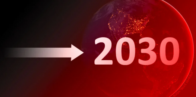
Canada still has eight years to achieve our 2030 climate target. But rising emissions over the last two years look like they've already pushed it out of reach. That’s because we are now at a point where each wasted year makes the remaining task overwhelmingly larger.
Have we already run out the clock on climate hope in Canada? Take a look at these five charts and decide for yourself.
My first chart shows the rapidly steepening path to Canada’s 2030 climate target.
The black line shows Canada’s past emissions. The green bull's-eye in the lower right is our target. And all those green arrows let you see the ever-steepening path to get there over the years.

Notice that 35 years ago, when Canada first promised to reduce planet-heating emissions, the path was a gentle ramp. That’s shown by the green arrow to the far left on the chart. If we had acted then, we would only have had to cut four million tonnes of CO2 (MtCO2) per year — less than one per cent per year. As we will see below, that’s essentially the path the Europeans took.
Instead, Canadians wasted decades while our emissions drifted higher. Along the way, our path slowly grew steeper.
Now fast-forward to the recent years on the chart (highlighted in yellow). In 2020, the global pandemic shrank Canada’s economy and knocked our emissions down by a record amount. At that point, Canadians needed to cut 22 MtCO2 per year to reach our target. But instead of cutting emissions in 2021, we increased them. This rocketed our needed cuts up to 26 MtCO2 per year. Then, last year, we increased emissions again, according to estimates by the Canadian Climate Institute. This shot our needed cuts up by even more — reaching 31 MtCO2 per year.
And if we increase emissions again this year — like we did after the last global economic downturn — then our needed cuts will leap by an even larger amount.
That’s the brutal math of foot-dragging. The penalty for failing to act is small early on, leading to complacency. But towards the end, small delays carry overwhelming penalties. That’s the position Canadians are in now.
The brutal math of Canada's foot-dragging on reducing greenhouse gas emissions that will fry our planet. @bsaxifrage writes for @NatObserver #cdnpoli #emissions #GlobalWarming #climate #GHGs - Twitter
My second chart illustrates how huge our needed cuts are now.
It shows the annual change in Canadian emissions since 1990. This allows you to quickly compare the annual cuts we need now to what we’ve done in the past.

The black bars show increases. For example, the rightmost bars show the increases in 2021 and 2022.
The green bars show years when we reduced emissions while our economy grew. Yeah, not many and mostly tiny.
Now compare what we’ve done to the 31 MtCO2 we need to cut each year — for the next eight years — to meet our target. Those needed cuts are shown by the highlighted line way down on the right.
As you can quickly see, Canadians have never reduced emissions by anything close to this amount in any normal economic year. Not even once.
This chart also shows how fast the penalty for failing to act is now growing. The amount we needed to cut in 2021 and 2022 is shown by grey dashed lines. Note how these dashed lines are plunging further downward with each wasted year. I’ve added a bottom one, labelled “2024?” That’s what we face if we increase emissions again this year.
As I noted above, this chart excludes years when Canada’s economy shrank. This has happened twice since 1990. Both were driven by global crises — the 2009 financial meltdown and the 2020 global pandemic. They are marked by orange dots on the chart. Those years obviously aren’t relevant comparisons because Canada isn't planning to intentionally shrink our economy.
My third chart provides another way to visualize how improbably huge our emissions reductions need to be.

On this chart, the black bars show Canada’s current emissions broken down by sector.
Emissions range from a low of 20 MtCO2 per year from our waste sector, up to nearly 200 MtCO2 per year from the oil and gas industry.
You can compare those to the reductions needed to meet our target — shown by the tall, dashed line on the right.
In total, Canadians need to reduce our climate pollution by nearly 250 MtCO2 by 2030. As you can see, that’s far more than any single sector emits. For example, if we could eliminate all tailpipe pollution from every car and truck — large and small — across Canada, it wouldn’t be nearly enough on its own. We no longer have the luxury of targeting our cuts in just one or two sectors.
Each year, we need to cut another 31 MtCO2. That amount is shown on the chart by the lowest green line. To appreciate what it would take to cut that much just once, consider that:
The next few years will go by quickly. To appreciate what is needed over just three years, look at the chart’s upper green line. It marks 93 MtCO2 in emissions reductions. For scale, every three years we need to cut:
The clear takeaway from this chart is that Canadians need to dramatically reduce our climate pollution across all sectors. Everything all at once. And because fossil fuel burning causes most of it, we need to rapidly ratchet down the amounts we burn in all parts of our economy and lives.
If we haven’t already started cutting fossil fuel emissions this year, then our task in future years will grow ever more extreme.
My fourth chart shows the paths our peers in the Group of Seven (G7) have taken.
Collectively, these wealthy, industrialized nations emit one-third of global climate pollution and produce half the world's GDP. If we are going to have any shot at preventing a full-blown climate crisis, this group with much of the world's financial resources, capabilities and talent must lead the way.

On the chart, the line showing each nation's emissions is divided into three parts. The 1990s and 2000s decades are grey. The 2010s decade is coloured. And pandemic years since then are dotted. At the end is a yellow dot and flag showing the most recent emissions. As you can see, all G7 nations now emit less than they did in 1990 — except Canada. We still emit far more.
The path all our G7 peers took downward was to steadily reduce emissions over a decade or more. You can clearly see a long decline for each nation except Canada on the chart.
For example, look at the trends during the last decade, the 2010s. I’ve shown these years as colourful solid lines. Notice how all G7 nations — except Canada — reduced emissions during that critical decade.
We, alone, wasted that decade. Our foot-dragging left us ever further behind our peers. Just look at that gigantic 65 per cent action gap that has opened up between what our Commonwealth peers in the United Kingdom have done with their climate pollution versus what we’ve done in Canada. We've been choosing to fail.
My final chart adds each nation’s 2030 climate targets.

Canada’s 2030 climate target is shown by the green bull's-eye. It’s the weakest in the G7, at 25 per cent below our 1990 level.
It’s worth noting how other nations managed to reduce their emissions to the level we are aiming for.
For example, the U.K. has led the world in cutting climate pollution. It took them two decades of steadily reducing emissions to get to that level. And it took the European Union nearly three decades.
Canadians have just eight years left to get there, and we aren’t even back to the 1990 starting line yet. Not even close.
What these last charts show is that the nations that have made deep cuts to emissions have done it by consistently reducing emissions for decades.
To consistently cut emissions, it helps to have economy-wide policies that force reductions all along the way. A great example that we could adopt at any time is the U.K.’s Climate Change Act of 2007. It legally requires the government to meet sharply falling carbon budgets that cover all emissions in every year. And it set up an independent commission with broad powers to develop legislation and to keep the nation on track to meet current and future budgets.
I guess this is the point in a climate article when I’m supposed to offer some hopeful “we-can-still-avoid-saddling-all-future-humans-with-a-dystopian-climate” scenario.
But after 35 years of broken promises and failed half-measures in Canada, it’s hard to see any hopeful scenario Canadians are willing to act on. We certainly know what we need to be doing. We just refuse to act — year after year, decade after decade.
As we continue super-emitting — even as climate impacts grow ever more extreme — my thoughts keep returning to Elizabeth Kolbert's closing observation in her early climate book, Field Notes from a Catastrophe: "It may seem impossible to imagine that a technologically advanced society could choose, in essence, to destroy itself, but that is what we are now in the process of doing."
Maybe we just aren’t going to save ourselves after all.