Articles Menu
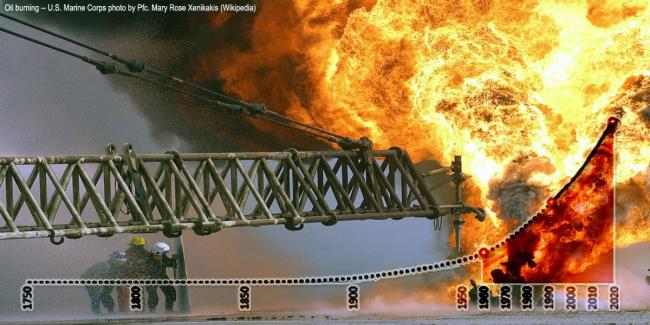
Despite decades of promises to prevent a climate crisis, the primary cause of it — global fossil fuel burning — continues to increase rapidly. Last year's record-breaking burn was a doozy.
That's according to data in the latest "BP Statistical Review of World Energy."
And renewable energy — a hoped-for climate solution — has not only failed to halt the explosive rise in fossil carbon burning, it's falling ever-further behind.
I've dug into the latest BP energy report and created 10 charts that illustrate humanity's high-octane acceleration off the climate cliff.
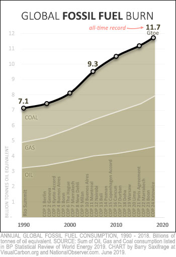
My first chart shows the amount of global energy produced by burning fossil fuels each year. As you can clearly see, humanity just keeps burning more and more.
If this seems surprising to you, it could be because the BP report doesn't have any charts or tables showing total fossil fuel use. To create this and the other charts for this article, I had to download and combine separate spreadsheets for oil, gas and coal.
Back in 1992, the world gathered at the Rio Summit promising to prevent fossil fuel pollution from unleashing a full-blown climate crisis onto future generations. As the chart shows, humans burned 7.1 billion "tonnes of oil equivalent" in fossil fuels per year back then.
Note: A "tonne of oil equivalent" (toe) is an energy metric equal to ~42 gigajoules that BP and others use to compare different sources of energy. An "Mtoe" is a million "toe" and a "Gtoe" is a billion "toe."
Since that original global climate conference, there have been 24 more, as shown on the chart. And yet, as the chart also makes clear, the amount of fossil fuels burned each year hasn't gone down. It hasn't levelled off. It has only surged upward.
Last year, the fossil fuel pyre jumped to another record — 11.7 Gtoe. Both oil and gas burning also set new records. Even coal burning, which fell slightly for a few years, has started rising again. Its now just two per cent below its all-time high. To paraphrase Mark Twain: rumours of its death have been greatly exaggerated.
In total, humanity now burns two-thirds more fossil fuels than in 1990.
Do you see any hint of "climate progress" in that data? I sure don't. I see the very opposite.
It's no wonder millions of children around the world are growing afraid of what the adults are doing to their future and have started "school striking" to try to save themselves. Or that extinction rebellions, birth strikes and climate despair are emerging.
As Greta Thunberg, the teenage Swedish climate activist leading the school strikes, recently said: "We are facing a disaster of unspoken sufferings for enormous amounts of people... We have to acknowledge that the older generations have failed... it is now time for civil disobedience. It is time to rebel."
To appreciate just how extreme the burning has been in recent decades, it helps to see it in the greater context. My next chart shows just that. It shows cumulative global fossil fuel burning since humans started doing it in earnest with the industrial revolution.
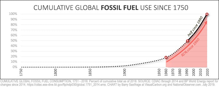
The solid black part of the line shows that half of all fossil fuels burned in human history have been burned since 1990. This has occurred during the "climate crisis" years in which adults understood the threat it posed, and repeatedly promised to do something about it.
In fact, more than 80 per cent of all fossil fuel burning has occurred during the lifetime of the "baby boomer" generation. That's my generation. We got to enjoy the amazing benefits a stable climate provides.

Instead of safeguarding this heritage to pass along to future generations, we've set it on fire. And each year, we make the pyre even bigger.
What we are passing down to younger generations is a turbocharged climate Hydra which is starting to lash out at humans and the ecosystems we depend on.
In the Greek myth, Hercules fought the Hydra. In our modern reality, we are feeding ours ever-greater amounts each year. The serpents of drought, heat waves, floods, rising seas, super storms, wildfires, acidifying oceans and eco-collapse keep growing more powerful and aggressive.
What about renewable energy?
One of the great climate hopes has been that rising amounts of renewables and nuclear energy would cause fossil fuel burning to start falling.
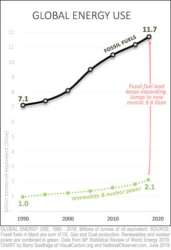
My next chart lets you see what happened instead. The green dotted line shows how much climate-safe energy was used each year. This line includes the BP data for renewables (like hydro, solar and wind) as well as nuclear energy.
Climate-safe energy did indeed increase significantly since 1990, rising by 1.1 Gtoe.
But humans increased fossil fuel burning four times more.
Climate-damaging energy use is not just rising. It is pulling away from the climate-safe alternatives.
Fossil fuel's lead has widened from 6.1 Gtoe in 1990 to 9.6 Gtoe today.
In practical terms, this means that each year, the amount of clean energy that must be added to replace fossil burning keeps getting larger and larger — not smaller.

In a Greek myth symbolizing futility, Sisyphus kept moving a boulder to the top of a hill only to have it roll down again, forcing him to do it over and over.
Humanity is stuck in the same endless cycle, trying to build enough new clean energy to replace dirty energy. Except in our modern version, the size of the clean-energy boulder that needs to be shouldered keeps getting larger each time.
Despite the task growing ever-larger, Bloomberg just reported that worldwide investments in clean-energy projects have fallen yet again, to a six-year low. Clean-energy investments declined in all three major markets — the U.S., Europe and China.
At this point, it is just another form of climate denial to expect clean energy to force fossil fuel burning to fall — let alone fall all the way down to zero as required to avoid a climate crisis.
My next chart shows the annual changes in global energy use.
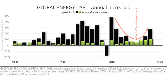
As the black bars show, fossil fuel burning has increased in 27 of the past 28 years.
The only outlier year was 2009, and that was caused by a sudden global recession. The very next year, however, fossil burn rebounded with the biggest increase in human history.
For a few years after this, the annual increases in fossil burning were getting smaller. Hope flickered briefly that the fossil burn might stop increasing. Adding to this hope was the global Paris Climate Agreement in late 2015, in which the entire world promised to increase climate ambition.
Unfortunately, as the red arrow on the chart makes clear, as soon as the ink dried on the agreement, the world reversed course and started increasing the increases in fossil fuel burning.
And last year, humanity's sprint away from climate safety accelerated yet again as the global fossil burn jumped to fill two-thirds of new energy demand.
Renewables, in contrast, stumbled last year. According to the BP report summary, in 2018, "all fuels grew faster than their 10-year averages, apart from renewables."
But, aren't fossil fuels losing market share? That's a sign of climate progress, right? Unfortunately, it isn't. To understand why, take a look at my next chart.
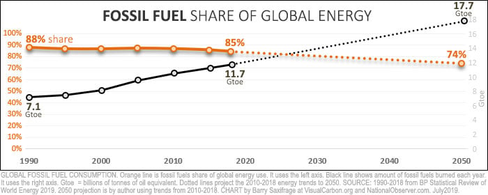
The orange line shows fossil fuel's share of global energy use. It fell three percentage points since 1990. However, the black line shows that the actual amount of fossil fuels burned rose dramatically. The mathematical reason why these both could be true is that global energy use expanded faster than fossil did. As a result, the larger amount of fossil took up a slightly smaller share of the even larger energy pie.
Unfortunately, the climate doesn't care what share of the energy pie fossil fuels have. The climate only reacts to the total amount of fossil fuels we burn — that's the black line on the chart. And as long as that black line is rising, we are accelerating away from climate safety.
To avoid a full-blown climate crisis, that black line must fall to "net zero" by 2050 or sooner. That's according the latest and best science in the IPCC Special Report on 1.5 C.
Unfortunately, we are still headed in the opposite direction. The dotted lines on the chart show where we will end up if we continue with the global energy trends since 2010. Fossil burning will continue rocketing upward, even as its share keeps falling.
So far, we've looked only at data for the world as a whole. Next, I'll drill down into the BP data to show what Canada and some other countries have done.
There are 200 countries, so to keep the charts manageable, I'll focus on just the G20 countries, which includes the European Union (EU). Collectively, these countries account for roughly 90 per cent of global GDP and fossil burn.
Amount burned per capita
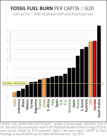
My first G20 chart shows fossil fuels burned per capita last year.
India burns the least per person, at less than half the global average.
The Chinese and Europeans are in the middle of the pack. They all burn more than the global average.
Canadians and Americans are at the extreme end — burning four times the global average. Only the Saudis, in dead last, burn more than we do.
Back in 1990, Canadians burned much less than Americans, per person. Now, we burn more than they do.
Changes per country
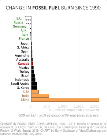
My second G20 chart ranks countries by the amount they have changed their fossil burning since 1990.
At the top, in green, are countries that reduced their fossil fuel use. These are the major European economies and Russia.
Obviously, it's possible to cut fossil fuel use. These major economies have done it.
Canada is in the middle of the pack, in red. We increased our annual burn by 57 Mtoe.
At the bottom of this chart, in orange, are the world's three most populous countries. Combined, these three accounted for two-thirds of the global increase in fossil fuel burning. China alone accounted for around half the global increase.
Change per person
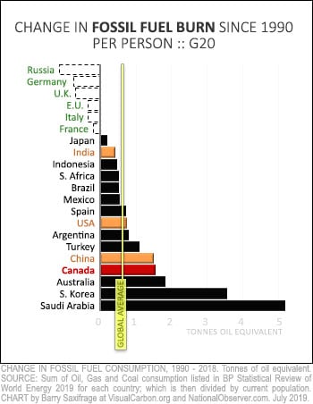
My next chart shows the same country changes — but this time divided by their current population.
This lets you compare what has happened on a person-to-person basis.
As you would expect, the biggest shifts in the rankings are for the world's most populous countries. China moves off the bottom, but still has an increase far above the global average. The U.S. moves to the middle. And India moves even higher.
Canada falls toward the bottom.
Canada's much larger increase than the U.S. since 1990 explains why we've now passed them up in the amount we burn per capita.
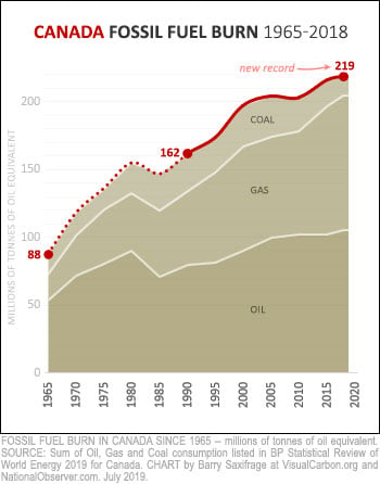
Let's drill down one more level into the BP data to get a more detailed view of Canada's fossil fuel burning history.
The resulting chart on the right shows the amount of oil, gas and coal we've burned each year since 1965.
The first thing that jumps out is that Canada just keeps burning more and more as the years go by.
Last year, we set an all-time record by burning 219 Mtoe worth of fossil fuels.
Canada's coal burning has fallen to less than half of what it was at its peak in 2002. But all that climate progress has been more than wiped out by surging oil and gas burning. Fossil oil burn has grown by a third since 1990 and fossil gas burning has nearly doubled. Both are still rising, driving total fossil burn to record heights.
Where could Canadians look for ideas to reduce our fossil burn?
My final chart compares Canada's fossil burn to those from three of our closest allies. It shows changes since 1990.
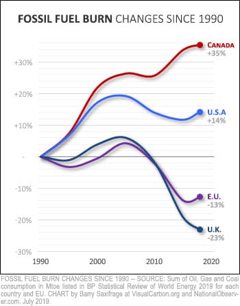
The U.S. and the EU are the world's two biggest economies. Fossil fuel burning in both appears to have peaked more than a decade ago.
If they can stop increasing fossil fuel burning, surely Canada can as well.
The Europeans, in particular, have made significant cuts in fossil fuel use since peaking. We could adopt some of the climate policies that are working for them.
And our commonwealth peer, the U.K., has done even better. They've enacted an innovative carbon budget law that is designed for climate success. We could enact the same kind of law here.
Canadian politicians like to say that we are world leaders in the climate fight.
The energy data in this BP report shows the opposite. It shows that Canadians burn more fossil fuels per capita than almost any other country. And it shows that instead of cutting back as required to prevent a full-blown climate crisis, we just keep burning more and more.
If Canadians want to pass along a safe and sane climate system to our future generations, we will need to quickly change course. Many of our peer countries peaked fossil burning years ago and have policies we could adopt.
[Top photo: Oil burning - US Marine Corps photo by Pfc Marie Rose Xenikakes (Wikipedia)]